Tradeoffs Part 1 — Tradeoffs as shared points of reference.

 
Producer/engineer Young Guru, mulling tradeoffs at the mixing console.  Image via massappeal.com.

Producer/engineer Young Guru, mulling tradeoffs at the mixing console.  Image via massappeal.com.


When we discuss art, it’s natural for us to employ evaluative language.  Doing so, however, often overlooks the fact that evaluative language only points back at us, the audience.  It doesn’t point at the work.  We can argue about the best Ella Fitzgerald performance or Joni Mitchell song, but those arguments only establish the taste of those in conversation.  It does little to illuminate what the artists themselves are up to.  

Nevertheless, we need language with which to talk about art.  For example, when I read a student work, and it’s not working for me, I need to be able to talk about why in terms that are concrete, beyond dispute.  One way to do that is to describe my experience of the work.  “I was confused on page four because . . . .”  A writer can hardly disagree with such a statement from a reader.  She can’t say, “No, you weren’t confused.”  The objective nature of the conversation helps keep things clear for all.

Another way to talk in concrete terms is to discuss the tradeoffs made by the artist.   Even when two people disagree on a work’s success or failure, they can agree on the tradeoffs that were made and what resulted from those tradeoffs. 

For instance, in my posts about musical time, I listed some tradeoffs that are made when drumming becomes rounder (more even) or less round (more uneven).

Whether or not I can persuade you that Ringo Starr’s sense of time is better than a drum machine’s (which is really a conversation about my listening), we can agree that Ringo’s imperfect time-keeping infuses the Beatles with a certain vulnerability that a drum machine cannot.  Likewise, we can agree that if the Beatles had used a drum machine that rendered perfectly even time, the result might have been something less vulnerable and more invincible.

Tradeoffs, thus

  • Provide concrete points of reference for people who may disagree as to a work’s success or failure.
     
  • Help us remember that creativity is all about choices.
     

The language of tradeoffs thus help us distinguish between conversations about the artist’s choices from conversations about our response to those choices.   The different tradeoffs each of us might make reflect differences of intuition and taste. 

The language of tradeoffs therefore helps us take responsibility for how we receive the work.


Thank you for reading.

Roughness Part 4 supplement — Revealing the Errors of Making

 
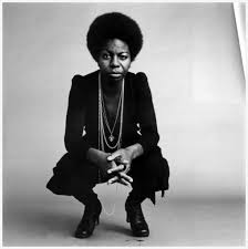
Nina Simone.  Image via jazzinphoto.wordpress.com.

Nina Simone.  Image via jazzinphoto.wordpress.com.


At the beginning of this recording of “I Shall Be Released,” Nina Simone can be heard stopping the band and exhorting them not to push.  The false start and the brief correction she gives to the musicians were preserved as part of the recording. 


All of that might have been cut, but its inclusion provides a window into the making of the song and the difficulties of recording and performing.  Simone’s dialogue enlivens the recording not only because it’s interesting to hear a performer at work in the studio, but also because we then listen to the song knowing that the question of not pushing is in the minds of the musicians.  Even as the song progresses and we let go of that concern, the rough and tumble moment at the start has infused the performance with a little more life. 

Simone in the studio.  Image via ninasimone.com.

Simone in the studio.  Image via ninasimone.com.


We have heard something more like the whole truth of the recording, and it feels more alive as a result. 


Thank you for reading.

Roughness Part 4 supplement — “Roxanne”

 
Image via 45cat.com.

Image via 45cat.com.


The story goes that Sting accidentally sat on a keyboard in the studio as the Police were recording “Roxanne.”  You can hear it at the 0:04 second mark, followed by his laughter.


 Consider how the discord and ensuing laughter enliven the performance.  They give the song a comic dimension, something that within the context of the song’s subject matter might evoke drunkenness and the street.  This moment of comedy makes the song feel more lifelike and complete.


Thank you for reading.

Roughness Part 4 supplement — “Honour Thy Mistake”

 
John Masefield.  Image via poetryfoundation.org.

John Masefield.  Image via poetryfoundation.org.


The Oblique Strategies are the creation of musician Brian Eno and artist Peter Schmidt.  The strategies are a collection of statements, commands, principles, and questions designed to help artists break through creative logjams. 

They originally existed as a deck of cards, so an artist working on a project could, if stuck, reach for the deck, draw a card, and act upon what the card offered.

Examples include . . .

Reverse.
Use an old idea.
State the problem in words as clearly as possible.
Only one element of each kind.
Cascades.
What would your closest friend do?
What to increase? What to reduce?
Are there sections? Consider transitions.
Try faking it!
Ask your body.
Work at a different speed.

One of the cards has particular relevance to roughness: “Honour thy error as a hidden intention.”

Consider the case of “Sea Fever,” a poem by John Masefield.  The opening line may well have been written . . .

I must go down to the seas again, to the lonely sea and the sky

But in various versions, the line appears . . .

I must down to the seas again, to the lonely sea and the sky

This may have been the result of a printing error.  Here is a proof of an early printing.

But later printings restore "go down," as Masefield himself reads the poem in this recording.


Some people know this poem in the first version, and others know it in the second.   Whichever version one prefers, one can hear that the strangeness of the mistake takes on intention and mystery

“I must down to the seas again, to the lonely sea and the sky.”


Thank you for reading.

Roughness Part 4 — Mistakes

 
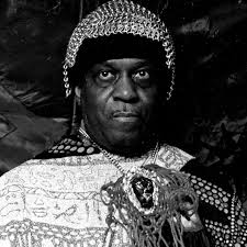
Sun Ra.  Image via waxpoetics.com.

Sun Ra.  Image via waxpoetics.com.


While roughness is an important intention, it often arises by way of mistake.  What can transform the appearance of a mistake from something accidental to something intentional?

Sun Ra has an answer.


You made a mistake
You did something wrong
You made a mistake
You did something wrong
Now make another mistake
And do something right
Make another mistake
And do something right

Note how the song encodes grace and groove.  Repeating her mistake allows an artist to enter into her accident and turn wrong to right.  And the song’s groove evokes the creative flow that is recovered by way of repeating a stumble.  The stumble may thereby be examined and mined for its insight.

Make another mistake, and do something right. 


Thank you for reading.

Roughness Part 3 supplement — The Temptations of Technology

 
Some of the great singers featured in 20 Feet from Stardom. From left: Darlene Love, Tata Vega, Merry Clayton, Judith Hill, and Lisa Fischer.  Image via billboard.com.

Some of the great singers featured in 20 Feet from Stardom. From left: Darlene Love, Tata Vega, Merry Clayton, Judith Hill, and Lisa Fischer.  Image via billboard.com.


Last year, I saw Twenty Feet from Stardom, a wonderful documentary that tells the story of some of the foremost background vocalists of the 1960s and 70s.  (Little did I know that some of them sang lead on tracks attributed to others.)

At one point, a producer from that era remarks on how none of the singers in the movie needed autotune or any of the other technology of the digital recording age.

True, but I wondered if the salient observation might be slightly different:  Engineers and producers have now been conditioned by autotune and don’t accept what they might have before the digital age.  Autotune and the trappings of digital recording are hard to resist.   Had they been available in the era documented in the film, who’s to say producers wouldn’t have used them? 

And what a loss that would have been!


Listening to “I Want You Back,” consider that young Michael Jackson’s less-than-perfect tuning is absolutely essential to the power of the performance, one of the greatest in the history of pop.  How many engineers of today can honestly say they would have left these tuning irregularities untouched by autotune?

When the technology for tidiness is available, it requires more than great restraint not to use it.  It requires something more than a commitment to authenticity.  It requires the knowledge and savoring of roughness, wholeness, and life.


Thank you for reading.


Roughness Part 3 supplement — Practice Roughness

 
Micky Waller.  Image via vickibrennerent.com.

Micky Waller.  Image via vickibrennerent.com.


As artists, we become what we practice.  That much seems obvious, but what might be overlooked is that rough playing, which has its place, must be practiced.  It is not necessarily available to a dexterous player.

Thus, jazz drummers who sit in with rock bands might be impatient with the music they are asked to play, but their rock colleagues might be even more impatient with the jazzer’s inability to convey authentic rock swagger, because swagger must be practiced.  The stumbles and slop that go with that swagger are essential elements of the rock and roll musical vernacular. 


Micky Waller’s drum groove on Maggie May is a thing of beauty, and roughness—its swagger and slop—is an essential element of that beauty.  In order to pull off such swagger, a more sophisticated drummer than Waller must take a break from perfecting her rudiments and dexterity around the kit and devote some time to hearing and reproducing the rough attitude behind this kind of performance—the particular way Waller’s sticks flail onto the drums, the caveman simplicity of his fills, the sense that his kick drum is held in place by ropes tied to his drum throne.  It will not be easy for her.  Waller's drumming is awesomely messy, and the mess cannot be reproduced by someone whose practice time is devoted to tidiness.


Thank you for reading.


Roughness Part 3 — Roughness as Intention, the quilts of Mary Lee Bendolph

 
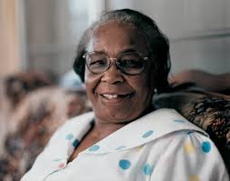
Gee's Bend quilter par excellence, Mary Lee Bendolph.  Image via soulsgrowndeep.org.

Gee's Bend quilter par excellence, Mary Lee Bendolph.  Image via soulsgrowndeep.org.


Roughness reflects an artistic intention.  Without the intention, roughness will be airbrushed away and replaced with something lacking in depth.

The stunning work of quilters such as Mary Lee Bendolph stems in part from her operating within constraints—what materials are available—but much more from her artistic choices. 

"Lonnie Holley's Freedom" by Mary Lee Bendolph.  Image via artsy.net.

"Lonnie Holley's Freedom" by Mary Lee Bendolph.  Image via artsy.net.

 
"Strip Quilt" by Mary Lee Bendolph.  Image via artsy.net.

"Strip Quilt" by Mary Lee Bendolph.  Image via artsy.net.

 
"Blocks, Strips, Strings and Half Squares" by Mary Lee Bendolph.  Image via whyquiltsmatter.org.

"Blocks, Strips, Strings and Half Squares" by Mary Lee Bendolph.  Image via whyquiltsmatter.org.


For instance, she surely has the skills to make her quilts perfectly rectilinear, but doing so would deprive these quilts of their magic, which relies on what architect Christopher Alexander might term their roughness.

As I mentioned in Part 1 of this series, Alexander believes that . . .

“Things which have real life always have a certain ease, a morphological roughness. This is not an accidental property.”  

“The seemingly rough arrangement is more precise because it comes from a much more careful guarding of the essential centers of the design.”

Christopher Alexander, Book One, The Nature of Order, p. 210, 211

One of Bendolph’s artistic strengths is her valorization of roughness.  She intends it and understands its necessity.  Craftspeople, painters, writers, music producers, and filmmakers might learn from her work if they wish to produce work of similar depth, so overflowing with life.


Thank you for reading.

Roughness Part 2 supplement — Demo Recordings

 
Singer songwriter Ruthann Friedman.  Image via theartsdesk.com.

Singer songwriter Ruthann Friedman.  Image via theartsdesk.com.


Demo recordings often capture something lost in the final version, and that something might be synonymous with what architect and theorist Christopher Alexander means by roughness. 

The rough edges of a demo recording can suggest completeness (and thus aliveness) in ways that a polished rerecording might not.  

For example, compare the snappy polish of the Association’s “Windy” . . . 


with the roughness of songwriter Ruthann Friedman’s original demo. 


Note the sparseness of Friedman’s demo arrangement, her bluesier singing, the texture of her guitar strings, the warp of the band’s groove and less-steady tempo.  The Association's much more professional recording presents an ode to a beautiful girl; Friedman sounds as if she is singing of someone whose eyes "flash at the sound of lies."  

While it lacks the Technicolor glory of the familiar Association version, the character marks in Friedman’s demo imbue it with a complete humanness that conveys life in a way the Association’s stellar version cannot.  


Thank you for reading.

Roughness Part 2 supplement — Robert McKee’s Solar System

 
Screenwriting teacher Robert McKee, whose lectures and writing on story design have influenced a generation of screenwriters and novelists.  Image via designersnotebook.com.

Screenwriting teacher Robert McKee, whose lectures and writing on story design have influenced a generation of screenwriters and novelists.  Image via designersnotebook.com.


In his famous book on screenwriting, Robert McKee lays out a convincing picture of what a story’s cast of characters might accomplish:

Imagine a cast as a kind of solar system with the protagonist as the sun, supporting roles as the planets around the sun, bit players as satellites around the planets — all held in orbit by the gravitational pull of the star at the center, each pulling at the tides of the others’ nature. 

Consider this hypothetical protagonist: He’s amusing and optimistic, then morose and cynical; he’s compassionate, then cruel; fearless, then fearful.  This four-dimensional role needs a cast around him to delineate his contradictions, characters towards whom he can act and react in different ways at different times and places.  These supporting characters must round him out so that his complexity is both consistent and credible.

Character A, for example, provokes the protagonist’s sadness and cynicism, while Character B brings out his witty, hopeful side.  Character C inspires his loving and courageous emotions, while Character D forces him first to cower in fear, then to strike out in fury.  The creation and design of Characters A, B, C, and D is dictated by the needs of the protagonist.  They are what they are principally to make clear and believable, through action and reaction, the complexity of the central role.

Robert McKee, Story: Substance, Structure, Style, and The Principles of Screenwriting, p. 379 

Consider, for instance, how The Mary Tyler Moore Show evokes this principle.  The show’s central character, Mary Richards, is the sun around which all other characters revolve.

Clockwise from upper left: Valerie Harper, Ed Asner, Cloris Leachman, Ted Knight, Mary Tyler Moore, Gavin McCloud.  Image via abcnews.go.com.

Clockwise from upper left: Valerie Harper, Ed Asner, Cloris Leachman, Ted Knight, Mary Tyler Moore, Gavin McCloud.  Image via abcnews.go.com.

 
  • Her best friend and neighbor, Rhoda Morgenstern (Valerie Harper), brings out the side of Mary that is cynical about life in a male-dominated culture.
     
  • Her other neighbor, Phyllis Lindstrom (Cloris Leachman) creates a point of contrast for Mary’s down-to-earth side, her rejection of shallow, bourgeois mores. 
     
  • New writer Murray Slaughter (Gavin McCloud) brings out Mary’s idealism. 
     
  • Newsroom boss Lou Grant (Ed Asner) activates her striving and desire for recognition.
     
  • Anchorman Ted Baxter (Ted Knight) brings out her principles.

And so forth. 

Notice how roughness and comic exaggeration characterize these supporting roles.  Their obsessions, their actions, their facial expressions reach extremes that Mary’s never do.  As in many sit-coms, the main character plays straight against everyone else in the cast.  Yet without the roughness, the flaws, embodied in the various supporting roles, the show does not feel complete.  Indeed Mary herself, per McKee’s insights, requires all of these characters orbiting around her to appear whole.


Thank you for reading.

Roughness Part 2 supplement —Three versions of Anne Sexton’s “Moon Song”

 
Anne Sexton.  Image via poetryfoundation.org.

Anne Sexton.  Image via poetryfoundation.org.


Consider these three presentations of the opening lines of Anne Sexton’s poem “Moon Song.”


Version #1


Moon Song


I am alive at night

I am dead in the morning—

an old vessel who used up her oil,

bleak and pale-boned.

No miracle.  No dazzle

I'm out of repair, 

but you are tall in your battle dress

and I must arrange for your journey.

I was always a virgin,

old and pitted.

Before the world was, I was,

. . .


Version #2

Moon Song typed.JPG

 Version #3

 image via theatlantic.com.


image via theatlantic.com.

Note how with each step, the presentation takes on more personality and arouses interest.

The presentation of version #1, rendered through flawless on-screen lettering, feels almost without personality.  Such perfection suggests something nameless, at best institutional, “The Internet.”

Note, by contrast, the personality already detectable in version #2, the typewritten version.  Here, the unevenness of the ink saturation, the typewriter's clumsy kerning of the letters (the lack of adjustments of space between individual letters) and the slight skew of the horizontal and vertical lines instantly lend the poem a clearer sense of human authorship, even as this same shift in presentation also makes the poem more difficult to read. 

That tradeoff is most pronounced in version #3, which is in Sexton's own handwriting.  Whether or not one would want to read an entire book of handwritten poems, Christopher Alexander’s principle of Roughness can be seen here in the fact that of these examples the third is both the roughest in appearance and by far the most alive. 


Thank you for reading.

Roughness Part 2 — Character and the Genius of Michael K. Williams

 
Michael K. Williams.  Image via bet.com.

Michael K. Williams.  Image via bet.com.


Those lucky enough to have seen the series The Wire will never forget the character Omar, brought to life by the brilliant Michael K. Williams

Omar stood outside of the cops-and-robbers dynamic of the main storyline because he robbed drug dealers.  His alliances shifted constantly, and the sense that he lived by a strict, if unorthodox, moral code of his own allowed his character to lay bare the sham moralities of the everyone else on the landscape, as he does in the following scene.

In a cast filled with some of the most talented character actors of a generation, Williams stood out for various reasons—the restraint of his portrayal and the truth of his performance (likely informed by his youth on the streets of East Flatbush), a surprising combination of warmth, humor, and cold-blooded clarity. 

He might also be recognized by the low, resonant rasp of his voice and the scar that slices down his beautiful face.  Though show-biz culture might reduce such traits either to disqualifiers (“I can’t cast anyone with a scar”) or the be-all of his on-screen presence (“Get me the guy with the scar!”), for Williams, these traits are merely elements of who he is as an actor.  His work neither dwells on nor eschews these traits; they are elements of his physical beauty and the larger truth of his artistry.  His acting thus exemplifies what a creator in any medium might aim to produce—work that accommodates one's whole self.  This is how Williams creates characters who feel complete and thus more lifelike.

And pulling back the lens, The Wire at large felt whole, more alive, because viewers felt they had seen all of the story.  The heroes of the show, Omar among them, were not the shallow, airbrushed fantasies of the street found on lesser dramas.  The intersection of their rough edges and beauty revealed something profound, something that felt complete and alive.  The truth is never the whole truth without all of its surprising detail.


Thank you for reading.

Roughness Part 1 supplement — Bob Dylan

 
Bob Dylan.  Image via sinistersaladmusikal.wordpress.com.

Bob Dylan.  Image via sinistersaladmusikal.wordpress.com.


In the previous post, we considered architect and theorist Christopher Alexander’s concept of Roughness, an element of wholeness in his schema.   The irregularities and imperfections that produce roughness help imbue a design with a sense of life.

“It is certainly noticeable that all great buildings do have various small irregularities in them, even though they often conform to approximate overall symmetries and configurations. By contrast, buildings which are perfectly regular seem dead.”

Christopher Alexander, Book One, The Nature of Order, p.214

Rock and roll abounds with examples of how roughness suggests the life force at work in the music.  For example . . .


Bob Dylan’s voice has been derided as toneless and out of tune.  These complaints miss the point.  Note how much more alive the words sound precisely because of his growling tone and sour tuning, which actually enliven the words.

As Shierry Weber Nicholsen notes . . .

The resulting combination of local symmetry and roughness, Alexander suggests, is the product of forces tending toward a larger order and integration . . .  

Shierry Weber Nicholsen
The Love of Nature and the End of the World p. 191

An intuitive listener knows not to hear Dylan’s gritty tone and tuning as shortcomings.  To her ears, the song comes to life through its rough presentation.

Another great version of the song, by the Byrds, has less in the way of roughness.


Whichever rendition of the song one prefers, and there are good arguments for both, we can hear the tradeoffs when Dylan’s grit and twisted tuning is replaced by the more pleasing chorale of the Byrds’ harmonies.  The Byrds by no means abandon roughness, but note that as the singing gains tuning and tone, the words lose some of their bite. 


Thank you for reading.

Roughness Part 1 — Roughness as Life-Affirming Element

 
Image via onekind.org.

Image via onekind.org.


(I am indebted to Donald Schell for introducing me to Christopher Alexander, and to Tom Kubla, who has posted extensively about Alexander’s theories on tkwa.com, where I found some of the following quotes from Alexander.)


The architect/theorist/philosopher Christopher Alexander postulates that life comes from wholeness.  In his schema, wholeness has fifteen basic properties.  One of them is roughness:

“Things which have real life always have a certain ease, a morphological roughness. This is not an accidental property”   

“The seemingly rough arrangement is more precise because it comes from a much more careful guarding of the essential centers of the design.”

Christopher Alexander, Book One, The Nature of Order, p. 210, 211

An example of roughness and its place within Alexander’s schema of wholeness might be the stripes on a zebra, as Shierry Weber Nicholsen explains:

A zebra’s stripes may be regular in their tendency, but they must fit around the various parts of the zebra’s body, which are only roughly symmetrical.  The resulting combination of local symmetry and roughness, Alexander suggests, is the product of forces tending toward a larger order and integration . . .

Shierry Weber Nicholsen
The Love of Nature and the End of the World p. 191

And thus, the irregularity of the stripes are what give us the sense of the zebra’s aliveness.  As Alexander explains . . .

“It is certainly noticeable that all great buildings do have various small irregularities in them, even though they often conform to approximate overall symmetries and configurations. By contrast, buildings which are perfectly regular seem dead.”

Christopher Alexander, Book One, The Nature of Order, p.214

So for instance, one can consider the difference between a handmade bookshelf and one purchased from Ikea.  The handmade shelf—by way of its roughness, its inexact cuts and its acute/obtuse angles—speaks of life, especially when contrasted with the mechanized, soulless precision of Ikea. 

Musical examples abound.


Stevie Wonder’s groove is irresistible, but it is important to note that it is also inexact.  Furthermore, the inexact nature of the groove is essential to the liveliness of his sound.  His drumming exudes a slightly warped sense of time, as if we are hearing a drumbeat that was left out in the sun, and the result is something that sounds more alive.  As Shierry Weber Nicholsen’s noted about wholeness . . .

The resulting combination of local symmetry and roughness . . . is the product of forces tending toward a larger order and integration . . .

This description captures an essential quality of Stevie Wonder’s solo albums of the early 1970s, the way in which the handmade sound of the performances with their various quirks and imperfections all point towards a larger and integrated whole, one that overflows with life.


Thank you for reading.

Critique Part 4d — Artwork has its seasons

 
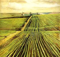
The Harvest,1915, by Zinaida Serebriakova.  Image via wikipedia.org.

The Harvest,1915, by Zinaida Serebriakova.  Image via wikipedia.org.

The Shoots of Autumn Crops, 1907, by Zinaida Serebriakova.  Image via wikipedia.org.

The Shoots of Autumn Crops, 1907, by Zinaida Serebriakova.  Image via wikipedia.org.

Veranda in Spring, 1899, by Zinaida Serebriakova.  Image via wikipedia.org.

Veranda in Spring, 1899, by Zinaida Serebriakova.  Image via wikipedia.org.

Most people have had the experience of encountering a song, a movie, or a book that they didn’t like, only to rediscover it later and wonder, “What was I thinking?  I love this!”

An artist would do well to keep this phenomenon in mind as she listens to responses from others and filters those responses through her intuition.  Sometimes the artwork is in Capricorn while the audience is in Mercury.

A famous case of this is the Hall and Oates song “She’s Gone.”  It was released off of their second album Abandoned Luncheonette.  It did well with the duo’s hometown listeners in Philadelphia, but did not connect as hoped with audiences elsewhere.  Two years later, after they had scored a nationwide hit with “Sara Smile,” the song was rereleased and became a top-ten hit.

It had found its season.


Thank you for reading.

Critique Part 4c — Questions

 
Legendary film editor and film sound mixer Walter Murch.  Image via qualitative-research.net.

Legendary film editor and film sound mixer Walter Murch.  Image via qualitative-research.net.

 
Author Michael Ondaatje met Murch during the making of The English Patient, an adaptation of Ondaatje's novel that was edited by Murch.  The conversations they had inspired Ondaatje's book of interviews with Murch, The Conversati…

Author Michael Ondaatje met Murch during the making of The English Patient, an adaptation of Ondaatje's novel that was edited by Murch.  The conversations they had inspired Ondaatje's book of interviews with Murch, The Conversations.

In the two previous posts, I suggested that artists do as little talking as possible as they listen to feedback and process it through their intuition.   

When a particular piece of feedback does not resonate intuitively, sometimes it pays to ask questions.  The resulting conversation may reveal that the critique in question had misstated things. 

A great example of this is found in The Conversations: Walter Murch and the Art of Editing Film, Michael Ondaatje’s book of interviews with film editor and sound mixer Walter Murch.  In this excerpt, Murch relates how the producer of the Godfather (for which Murch mixed the sound), responded to composer Nina Rota’s music score. 

Murch: There was an intense crisis with the music.  When Bob Evans heard Nina Rota’s music, he felt it would sink the film, that it was too lugubrious and didn’t have enough energy. . .  

Ondaatje: You mean the main theme music?

Murch: Yes . . . well, all the music.

Ondaatje: My God, it’s a trademark!

Murch: Well, nobody knew that at the time.  Remember, someone at MGM wanted to cut “Over the Rainbow” from The Wizard of Oz

(Murch told Ondaatje that Evans actually wanted to replace Nina Rota with Henry Mancini, to give the score more of an American flavor.)

Murch: Frequently what happens in film is that people, especially distracted executives, will say, I hate—pick one—the music, camerawork, art direction, acting in your film.  But if you actually get under the skin of that prejudice, you can discover the particular thing they really hate — the pea under the mattress.  It often comes down to one or two small things that spoil everything else.  When I talked to Bob Evans, it turned out he hated the music for the horse’s-head scene, where Woltz pulls the sheet back and the severed head of his half-million-dollar horse is revealed in the bed.  Maybe because Woltz is the head of a studio and Evans was the head of a studio and it’s a particularly striking, grisly scene—the first violence in the film—he felt the music should be appropriate to that.


I tried to listen to what Nino had written with Bob Evans’s ears, and I thought he had a point.  The music, as it was originally written, was a waltz and it played against the horror of the event.  It was sweet carousel music.  You were seeing those horrible images, but the music was counterpointing the horror of the visuals.  Perhaps it needed to be crazier a little earlier . . . 

. . . You now heard, superimposed on each other, things that were supposed to be separate in time.  So it starts off as the same piece of music, but then begins—just as Woltz realizes that something is wrong—to grate against itself.  There is now a disorienting madness to the music that builds and builds to the moment when Woltz finally pulls the sheet back.   

We played this version for Evans, and he thought it was fantastic. . .

The result was that some of the heat was taken off the music. 

Michael Ondaatje, The Conversations: Walter Murch and the Art of Editing Film, pp. 99-102 

Murch’s intuition about the music, that it was great, prompted him to dig further into the meaning of the feedback from Evans.  One can only imagine what the film might have been with out Rota’s score. 

Composer Nina Rota.  Image via bbc.co.uk.

Composer Nina Rota.  Image via bbc.co.uk.


Thank you for reading.

Critique Part 4b — Let the witnesses testify

In my instructions for my writing workshops, I ask those whose piece is under discussion to remain quiet.

The writer does not take part in the discussion except by my invitation.  Though this may suggest a courtroom atmosphere where the writer and her work are on trial, the workshop is something else entirely—a chance for the writer to discover how her readers’ experience aligned with her intentions.   Her silence aids her in that process. 

Indeed, if anyone is the judge, it’s the writer.  The readers are witnesses whose testimony about the experience of reading illuminates for her what worked and what needs further attention. 

When your work is being discussed, listen and take notes.  Though you may be frustrated when readers have misread or misunderstood some aspect your work, leaping into the discussion stops you from discovering the extent of their misunderstanding.  By letting them air their misunderstanding and confusion, you will have a better sense of how to revise your work.

Only by listening can the artist make sense of what the testimony has actually told her.


Testimony worth listening to — The Dave Holland Quartet, "Conference of the Birds."


The witnesses . . . 

Bassist and composer Dave Holland.  Image via jazzchicago.net.

Bassist and composer Dave Holland.  Image via jazzchicago.net.

 
Reed and flute player Anthony Braxton.  Image via ofa.fas.harvard.edu.

Reed and flute player Anthony Braxton.  Image via ofa.fas.harvard.edu.

 
Reed and flute player Sam Rivers.  Image via 977music.com.

Reed and flute player Sam Rivers.  Image via 977music.com.

 
Percussionist Barry Altschul.  Image via mtv.com.

Percussionist Barry Altschul.  Image via mtv.com.


Thank you for reading.
Critique Part 4a — Receiving Critique Through Intuition

 
Composer Maryanne Amacher.  Image via sound-art-text.com.

Composer Maryanne Amacher.  Image via sound-art-text.com.


As I watch students comment on each other’s work, I am sometimes horrified to see the writer scribble down every note of the conversation, nodding her head in anxious confirmation.

So many times I long to lean over and ask, “Are you simply going to act on every comment you receive here?   Most of them are missing the point of your piece!”

When receiving critique from her colleagues, an artist must remember to absorb the comments by way of her intuition.  Responses that resonate with her intuition may have something to tell her about how to proceed.  Those that do not might be set aside and if not discarded at least examined before they are acted upon.

Bad critique has the power to pull an artist out of dialogue with her intuition, whereas the best critique informs and deepens that dialogue.


Imagine how resolutely in touch with her own intuition composer Maryanne Amacher had to be to produce this piece.

  A detailed description of the piece can be found here.


Thank you for reading.
Critique Part 3 supplement — What about the blueberry pancakes?

 
Esther Lamandier.  Image via lastfm.com.

Esther Lamandier.  Image via lastfm.com.


One tendency of workshop students is to expect a work of art to answer all of the questions it raises, even if those questions are projected onto the art by the respondents. 

So for instance, a student will respond to a piece of writing by saying, “I wanted to know more about the blueberry pancakes.  I found them really interesting and wanted to know more.”

And I ask, “Why?”

 “Because they seemed interesting.  I wanted to have them myself."

"Okay, but what does that have to do with the story?"

"Um . . . "

"What is the story about?"

"It's about a man going off to war."

"Then what will more information about the blueberry pancakes do to advance that story?"

"Ah, not much."

"Right.  So, as a reader, reading the story, what do you want?"

"I see.  In that case, I really don't care about the pancakes.  (But I really love pancakes.)"

"Which is fine, but the writer has the right to create a world and fill it with all kinds of things that might interest us.  As long as she doesn't make promises about exploring those objects, you may have to content yourself with the fact that the writer is merely doing her job and creating a vivid scene, one aspect of which may appeal to part of you that is not focused on the story." 

"You don't need to know about the blueberry pancakes!" became such a familiar refrain for my students that at the end of the semester, one of them gave me this replica as a token of appreciation .

"You don't need to know about the blueberry pancakes!" became such a familiar refrain for my students that at the end of the semester, one of them gave me this replica as a token of appreciation .

Though the question in this example may have concerned a trivial detail, art may confront us with larger questions.  And as respondents, we might consider that  . . .

  • Questions draw us into the artwork.  They pique our curiosity.

  • Great art often leaves us with unanswered questions that point beyond the artwork and engage our imagination.

Sometimes the questions are obvious, as in the case of Frank Stockton’s story “The Lady, or the Tiger?

More frequently, the questions live in the fabric of the work.  Consider how many questions this ancient Syriac chant, sung by French soprano Esther Lamandier, leaves in its wake. 


We may leave this piece with more questions than we had going into it.  And yet those questions open our minds to consider more than we had only moments earlier.


Thank you for reading.